 异常教程
异常教程
为 Google 的分析嵌入库创建自定义显示
💡一则或许对你有用的小广告
欢迎加入小哈的星球 ,你将获得:专属的项目实战(已更新的所有项目都能学习) / 1v1 提问 / Java 学习路线 / 学习打卡 / 每月赠书 / 社群讨论
- 新开坑项目:《Spring AI 项目实战》 正在持续爆肝中,基于 Spring AI + Spring Boot 3.x + JDK 21..., 点击查看 ;
- 《从零手撸:仿小红书(微服务架构)》 已完结,基于
Spring Cloud Alibaba + Spring Boot 3.x + JDK 17...,点击查看项目介绍 ;演示链接: http://116.62.199.48:7070 ;- 《从零手撸:前后端分离博客项目(全栈开发)》 2 期已完结,演示链接: http://116.62.199.48/ ;
截止目前, 星球 内专栏累计输出 100w+ 字,讲解图 4013+ 张,还在持续爆肝中.. 后续还会上新更多项目,目标是将 Java 领域典型的项目都整一波,如秒杀系统, 在线商城, IM 即时通讯,权限管理,Spring Cloud Alibaba 微服务等等,已有 3700+ 小伙伴加入学习 ,欢迎点击围观
我已经写过几次关于谷歌 分析嵌入 库的博客。我真的很喜欢它,因为它使使用他们的分析 API 变得非常简单。它真正开启了仅使用普通 javascript 在您的站点上创建有趣的混搭和 自定义仪表板 的能力。最近,一位读者问我一个问题,关于他如何才能更好地控制图书馆显示的数据。
他的 问题 涉及图书馆支持的“表格”显示格式。这是一种我自己还没有使用过的格式,所以我建立了一个快速演示(并且由于读者提供了一些代码,所以它变得更容易一些)。让我们看看代码,然后我会显示结果。
 <!doctype html>
<html>
<head>
  <title>embed api demo</title>
</head>
<body>
<!-- step 1: create the containing elements. -->
<section id="auth-button"></section>
<h2>raymondcamden.com</h2>
<section id="timeline"></section>
<!-- step 2: load the library. -->
<script>
(function(w,d,s,g,js,fjs){
g=w.gapi||(w.gapi={});g.analytics={q:[],ready:function(cb){this.q.push(cb)}};
js=d.createelement(s);fjs=d.getelementsbytagname(s)[0];
js.src='https://apis.google.com/js/platform.js';
fjs.parentnode.insertbefore(js,fjs);js.onload=function(){g.load('analytics')};
}(window,document,'script'));
</script>
<script>
gapi.analytics.ready(function() {
// step 3: authorize the user.
var client_id = '818125206534-g1r0datdtu9serq2pf9cp5vkuih3h8pv.apps.googleusercontent.com';
gapi.analytics.auth.authorize({
container: 'auth-button',
clientid: client_id,
userinfolabel:""
});
// step 5: create the timeline chart.
var timeline = new gapi.analytics.googlecharts.datachart({
reporttype: 'ga',
query: {
'dimensions': 'ga:date',
'metrics': 'ga:sessions,ga:avgsessionduration',
'start-date': '30daysago',
'end-date': 'yesterday',
'ids': "ga:31405"
},
chart: {
type: 'table',
container: 'timeline'
}
});
gapi.analytics.auth.on('success', function(response) {
//hide the auth-button
document.queryselector("#auth-button").style.display='none';
timeline.execute();

});
});
</script>
</body>
</html>
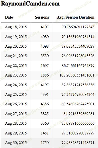
我假设您对我以前的文章有些熟悉,但如果不熟悉,这里的基本思想是嵌入库将处理身份验证并提供呈现功能。您可以看到那里的数据图表调用处理查询(要获取的数据)和如何呈现它(表格)。这是结果:
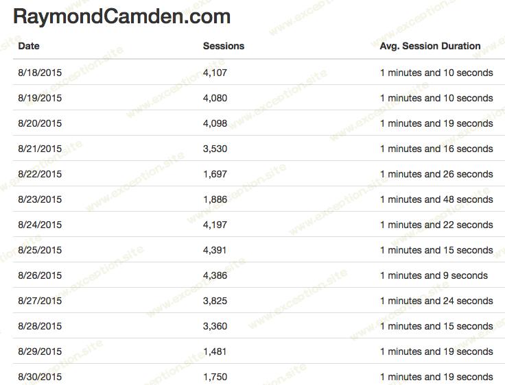
很好,但是如果你想更好地控制渲染怎么办?具体来说,用户希望将秒列更改为显示分钟的报告。遗憾的是,您无法修改表格的格式。幸运的是,谷歌可以很容易地手动获取数据并做任何你想做的事。让我们看一下脚本的更新版本。
 <!doctype html>
<html>
<head>
  <title>embed api demo</title>
</head>
<body>
<!-- step 1: create the containing elements. -->
<section id="auth-button"></section>
<h2>raymondcamden.com</h2>
<section id="timeline"></section>
<!-- step 2: load the library. -->
<script>
(function(w,d,s,g,js,fjs){
g=w.gapi||(w.gapi={});g.analytics={q:[],ready:function(cb){this.q.push(cb)}};
js=d.createelement(s);fjs=d.getelementsbytagname(s)[0];
js.src='https://apis.google.com/js/platform.js';
fjs.parentnode.insertbefore(js,fjs);js.onload=function(){g.load('analytics')};
}(window,document,'script'));
</script>
<script>
gapi.analytics.ready(function() {
// step 3: authorize the user.
var client_id = '818125206534-g1r0datdtu9serq2pf9cp5vkuih3h8pv.apps.googleusercontent.com';
gapi.analytics.auth.authorize({
container: 'auth-button',
clientid: client_id,
userinfolabel:""
});
// step 5: create the timeline chart.
var timeline = new gapi.analytics.googlecharts.datachart({
reporttype: 'ga',
query: {
'dimensions': 'ga:date',
'metrics': 'ga:sessions,ga:avgsessionduration',
'start-date': '30daysago',
'end-date': 'yesterday',
'ids': "ga:31405"
},
chart: {
type: 'table',
container: 'timeline'
}
});
gapi.analytics.auth.on('success', function(response) {
//hide the auth-button
document.queryselector("#auth-button").style.display='none';
timeline.execute();

});
});
</script>
</body>
</html>
这里最大的变化是现在我要求数据,这样我就可以用它做任何我想做的事。您可以在
gapi.client.analytics.data.ga.get
调用中看到这一点。一旦我有了数据,我就可以随意格式化它。我决定变得有点花哨。
首先,我利用 intl 很好地格式化日期和数字。这是一个很酷的 Web 标准(请参阅我的文章—— 使用 intl ),使用起来非常简单。它还不适用于 ios,但幸运的是,您可以在 ios 中使用 css 进行“对齐”,这比国际化重要得多。
为了处理分钟显示,我使用了很棒的
momentjs
库。它有一个
duration
api,可以很容易地显示一段时间内的各个部分。我对我展示它的方式不是很满意——但显然你可以根据你的需要修改它。这是结果。
好了。希望这有帮助。我会分享一个在线版本,但它目前与我的网络资产相关联,所以它对你不起作用。需要明确的是,您可以轻松更改属性,或添加让用户选择其属性的支持。